
PersonalAIzation
Evaluating the impact of AI-Based personalization on the user experience and user acceptance of the occupants in a fully automated vehicle.

EatWorkBetter
A system to help young professionals develop better eating habits. Employing gamification and social media aspects to define the UX.
Tyler - Smart Virtual Nurse
Addressing and Enhancing the User Experience of patients in the waiting room before MRI/CT Scan, with a non-human virtual nurse.
Tovertafel Share
Improving the functionality of the Tovertafel, to include multiple stakeholders such as families and caretakers, through personalization of the Tovertafel.

Universal Driver Controller
Enhancing the user experience of drivers in vehicles by addressing safety and driver distraction through mapping most used controls on a single controller on the wheel.
Education
M.Sc Automotive Technology - ** User Centered Design**
Eindhoven University of Technology (2018-2021)
B.Tech Mechanical Engineering
Gandhi Institute of Technology and Management (2014-2018)
Experience
** Researcher**
Master Thesis
Fraunhofer-Institut für Arbeitswirtschaft und Organisation IAO (Jul 2020 - Jan 2021)
Intern
Human Factors Intern
Eindhoven University of Technology - I-CAVE Project
(Oct 2019 - Jan 2020)
Mechanical Design Intern
Pioneer Power Infra Limited (May 2017 - June 2017)
Methodologies
** Research Methods and Frameworks**
Qualitative
Brainstorming Sessions
Contextual Studies
Diary Study
Focus Groups
User Interviews
Quantitative
A/B Testing
Competitive Benchmarking
Surveys and Questionnaires
User Modeling
Personas
Journey Mapping
Scenario Development
Design Methodologies
Information Architecture
Interactive Prototyping
User Requirement Elicitation
Wireframing
Testing and Evaluation
Heuristic Evaluation (As per Heuristics and/or standards)
Moderated Usability Testing (In person as well as remote)
Tree Testing
Wizard of Oz Testing
Standards
ISO 9241-110
ISO 9241-210
ISO 26262
Tools
** Design and Prototyping Tools**
Adobe Ps/Id/Pr
Draw.io (Flowchart)
Figma
MATLAB GUIDE
InVision (Studio)
Marvel
Solidworks
Remote Collaboration Tools
Miro
MURAL
Programming/Data Tools
IBM SPSS Statistics 25
MATLAB/Simulink
Microsoft Office Suite
Testimonials
"I had the pleasure to supervise Shrivaas as an external supervisor from IAT University of Stuttgart/Fraunhofer IAO during his master thesis on “Evaluating the impact of AI-Based Personalization of Automotive User Interfaces in Fully Automated Vehicles”.I was especially impressed by his work ethic, his knowledge and implementation of UX methods all while the COVID19-pandemic was going on! and his strong enthusiasm for the topic he worked on. Besides his technical and creative skills, his positive can-do attitude really stood out. I will miss our discussions on AI and automated driving and am looking forward to see his future work!"
Valeria Bopp-Bertenbreiter
Supervisor - Master Thesis
IAT University of Stuttgart/Fraunhofer IAO
"I supervised Shrivaas during his internship project at TU/e, and I closely worked with him in realizing a prototype for an internal research project. The requirements of the project were abstract and there were several roadblocks in terms of technical limitations and opportunities. However, Shrivaas showed excellent drive, enthusiasm, and resourcefulness in overcoming the difficulties when they arose and delivering the final prototype in time.To be highlighted are Shrivaas’s excellent learning ability in quickly picking up the solutions to the technical challenges. He demonstrated great perseverance, applied a methodical approach to problem solving; and showed exemplary poise and composure in challenging times.I am confident that Shrivaas will be an asset to any team. I wholeheartedly recommend him to any employer, and wish him all the best."
Dr. Debargha Dey
Supervisor - Internship
Eindhoven University of Technology

Master Thesis
Evaluating the impact of AI-based personalization of in-car infotainment system in fully automated vehicles.
How can AI make the daily commute and activities of people easier?
This video visualizes one of the concepts and functionalities proposed through this work. This prototype and concept are showcased in the video, while the team at KIFZ (KI-Fortschrittszentrum Lernende Systeme und Kognitive Robotik) and Fraunhofer developed the working model of this concept and explain its functioning.
Note - This video is in German
Problem Definition
Artificial Intelligence (AI) enables machines to learn from experience and interact in a more intelligent and human-like manner. In an automated vehicle, we envision that personalizing the user interfaces helps in building a better experience and environment within the car to better suit the preferences of the occupants, by optimally adapting to their needs and requirements. We aimed to analyze the effect that AI can have on personalizing the automotive user interface and its functionalities to improve the user experience of the occupants of an automated vehicle. This includes identifying the functionalities of the HMI that can be personalized by AI, creating scenarios for personalization, identifying the practical and usability benefits that personalization offers, and by comparing this to contemporary car HMIs.
**Scientific Relevance **
AI – being one of core research topics of TU/e - has gained a significant influence on different industries like manufacturing and consumer electronics and has started to greatly impact human life. AI has also found its way into automobile HMIs, with Mercedes’ MBUX being a notable early example. Since incorporation of AI in car HMI is increasing, it is key to understand the impact of personalization of HMI, in order to facilitate effective interaction and thereby improve the trust and user experience of the occupants. Understanding how AI can be used in a human-centered and socially acceptable way is a timely societal research topic and the focus on in-car user interfaces and human factors establishes a clear link to trust and user experience.
Project Overview
Project in association with (client)
Duration of the project
July 2020 - January 2021 (7 months)
Nature of the project
Master Thesis (Academic), Exploratory Research and Design in AI-Based UX for automobiles
Tools Used
InVision Studio (Prototyping), Adobe CC, Concepts (Sketches), Screens Studio (Competitive Benchmarking), MS Teams, Miro/MURAL, Diagrams.net
Constraints
Since it was executed during the COVID pandemic, access to resources, users and testing equipment was not there. From the user research to the final usability testing, everything was executed online.However, my ability to adapt immediately and execute this project remotely, was a positive thing for me.
Project Supervisors
Process

DISCOVERY AND IDEATION
Discovery
Owing to the exploratory and academic nature of the project, the focus of the project was not just on the user experience of AI-personalized user interfaces in automated vehicles, but also on making a significant contribution to the academic research community in this field. Therefore, extensive literature study was also conducted in the form of a systematic review. I wanted to propose a new design space, which could be developed further in the future. Accordingly, I focused on identifying gaps in academic literature as well as solving a problem that could help have a real life impact.
Brainstorming Sessions / Focus Group
For this project, I started with a blank canvas. Therefore I conducted focus groups and a brainstorming session to understand current usage and expectations.
First focus group to understand how users currently used their cars' infotainment systems.
Second focus group to gain further inputs on current usage and its categorization.
Brainstorming session with colleagues from my specialization to gain perspective on features of an AI-enabled in car infotainment system.

Interviews
I spoke to some users from the previous focus groups, on how they felt about AI, automated driving, AI in vehicles and how they envisioned this would be in the future.Following this, I presented my thoughts and ideas to experts from TU Eindhoven, Fraunhofer IAO and colleagues in the field of AI (in companies such as Cisco, Microsoft and BNY), and then interviewed them to get their perspective on the ideas thus far, feasibility and how it would directly influence the implementation and the users.
Note - Identity hidden for privacy reasons.

Surveys / Questionnaires
In order to gain input from my users and understand them better for user modeling (personas, journey map, scenarios etc.), I deployed a questionnaire containing questions that helped me know the target user group better. The responses to the questionnaires, along with information from aforementioned user research, informed the user modeling.

Solutions (Use Cases)
Following the discovery process which consisted of user research, systematic review of literature, analysis of secondary research and competitive benchmarking, we arrived at a full list of use cases for this project. With the supervisor, these were open coded to categorize them better, and were split into 7 categories. We decided to choose two categories from these use cases to design, test and evaluate. The full use case list and the prioritization are described here.

Prioritization of the Use Cases
For prioritizing the use cases from the complete list presented above, a second level of research was conducted, which involved competitive benchmarking, questionnaires deployed and review of secondary research. Personalized services and contextual personalized shortcuts were chosen to evaluate the impact of AI-Personalized in-car infotainment system on the user experience and user acceptance.
Contextual Personalized Shortcuts
In 2012, Sandro Garzon claimed that modern infotainment systems had too many menu levels to navigate for the most used functions. Competitive Benchmarking on Screens Studio revealed that this statement was true 8 years later too.Contextual Personalized Shortcuts use AI to record the most used particular functions in an HMI by the user in specific contexts (day, time and location). The AI provides these particular functions (such as calling someone at a particular time, or navigating to work on weekday mornings) as shortcuts to users in that particular context.
Personalized Services
Secondary Research by PYMNTS showed the activities users performed most during their commute (such as picking up food, drive-thrus and picking up groceries). Research by Deloitte Digital, Accenture and Segment revealed that users preferred personalized shopping experiences.Personalized services combine the aforementioned, by providing an end to end solution to users, from receiving personalized recommendations for food to order, restaurant reservation and groceries, to the car commuting by itself to these places as per the users' choice.
Journey Map
To visualize my concepts from the primary personas' perspective, and to present it to the team at Fraunhofer IAO, I created a journey map. This journey map follows a day in the life of our primary persona, and shows how each feature fits into his day.

DESIGN
First Sketches
The first step that was taken to visualize these concepts was to create sketches of how this system would look. The user flow (the interaction flow for each use case) was also visualized using sketches. We used these sketches to iterate on the design before prototyping. One example is showcased here.

Interactive Prototype
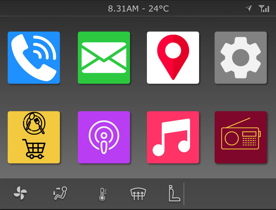
After iterating on the design decisions with the sketches, we decided to build the interactive prototype from there. I chose InVision Studio to build this prototype, and it was built in 4 parts (as per the interaction scenario for the usability testing). To stay consistent with industry standards, we used Mercedes AMG Styleguide for the fonts, sizes and colour scheme. The Icons were inspired by Google Android and Apple iOS with a few custom ones. It was made with an iPad screen dimension to facilitate usability testing.A few examples of screens from this prototype are shown here.
TESTING AND RESULTS
Remote Moderated Usability Testing
Following the development of the prototype, I wanted to conduct an expert evaluation to understand, evaluate and address usability issue. For this, I conducted a heuristic evaluation with 6 experts from Fraunhofer IAO and TU Eindhoven. I implemented the findings from this review, and then went on to conduct remote moderated usability testing. Owing to the COVID 19 pandemic, the testing had to be done remotely. The users watched a video on a primary screen, while a tablet acted as the HMI they interact with.

Results
How does the use of AI to provide contextual personalized shortcuts through the HMI to help the user perform frequent actions, impact the user experience?
When compared to conventional manually programmable shortcuts, the contextual personalized shortcuts scored higher in both user experience and user acceptance.Users reacted positively to the contextual personalized shortcuts. They emphasized that they liked the feedback and confirmation it provided for their selections. They also liked that the shortcuts now had meaning to them.
*** "I think it is (AI) better than before (non-AI). Now I am getting feedback that it works. That feedback is quite helpful for me to understand as well" ***
However, users also expressed it may take some time to get used to them, since users were accustomed to the way they manually programmed their shortcuts on their current devices.
How does the use of AI to provide personalized services throughthe HMI, impact the user experience and user acceptance?
The personalized services options were evaluated individually, since no such technology exists in cars of today, to compare. However, the personalized services features scored well for user experience and acceptance.Users expressed their happiness in being able to execute mundane tasks like grocery shopping from their car, and the fact that car automatically navigated to these places. They also loved the restaruant recommendations that the system gave.
*** "Yeah, it is a very nice approach, sometimes I travel across the states, so this helps us because we are very scared what restaurants are good." ***
Users however felt that the recommendations given by AI sometimes made them feel limited. They expressed that an option to bypass these recommendations or even something like a "Try This!" surprise recommendation would be good.
For the full results and discussion, including comprehensive analysis and user feedback, please refer to the full report
Reflection
How do I feel about this project and the outcome?I began this thesis right in between the COVID 19 pandemic and with a blank canvas in front of me. My main aim was to create a new design space and to contribute to the automotive UX academic research community, while focussing on what's feasible. I feel proud to have completed a Masters' project in a comprehensive manner, encompassing as many steps as possible, but fully remotely. Accordingly, the thesis was awarded with a grade of 8.5.What could I have done better?I definitely feel that certain things could've been done better. For instance, I would've loved to conduct more user interviews. I also feel the visual design of the prototype could've been slightly better, particularly with titling and the icons. I also should've added an option for the user to bypass the AI recommendations, but due to time and testing restrictions, I did not.Had the COVID 19 pandemic not existed, what would I have done differently?I would've conducted more in person interviews, that would've been great! I would also have conducted this test on the driving simulator or the mobility lab of TU Eindhoven. I would also have loved to conduct some contextual studies to understand how users currently use their in-car infotainment systems.
Get in touch!

EatWorkBetter
A system to help young professionals develop better eating habits. Employing gamification and social media aspects to define the UX.
How can we influence young employees to eat healthier at work?
In this project, we were tasked with investigating and understanding the eating habits of young employees, and coming with a solution to improve their eating habits. Following the user centered design process, we set out on trying to come up with solution that focussed on addressing their motivation and long term effects.
Project Overview
Project Course
User Experience Design
Duration of the project
April 2019 - June 2019
Scope of the project
Discovery, Identification of problem, Concept Definition, Wireframing and Prototyping, Presentation on Demo Day
Tools Used
Marvel (Prototyping), Adobe CC, Design with Intent cards, 6-3-5 Ideation, Google Forms (Diary Study)
Team Members
Floris Van Himbergen, Flavia van Tilburg, Jeroen Krukkert, Clarisse Mehrain, Shrivaas Madapusi Sundar
My Roles in the Team
Conducting Diary Study and interviews with young professionals (Research)
Part of the ideation session for broad concept development
Part of modified 6-3-5 ideation process - proposing gamification as a concept
Part of ideation using Design with Intent
Design of the interface prototype
Constraints
Short duration of project meant shorter time to focus on and build from user research.
Time and permission constraints to conduct contextual study on the subjects
Process

DISCOVERY
To obtain rich exploratory data, we decided to conduct a combination of a short diary study and a follow-up interview with the same group of participants. Before starting the official data collection, a small pre-study interview was conducted with 6 individuals to get a rough idea of the eating habits of young professionals.
Diary Study
Diary study was conducted to understand the eating habits of the young professionals, considering the desired qualitative data.A total of 20 participants filled out the - through Google forms provided - diary study three times a day during three consecutive days. Participants were requested to fill in the diary during breakfast, lunch and dinner. Within the diary, questions regarding eating time, mood, and the way of consumption were posed. Finally, each meal study ended with taking a picture of the food the participant ate.

Click on image to view full size
Interviews
To further elaborate on the diary studies, the participants were interviewed face-to-face, which resulted in additional in-depth information. Within these interviews, participants were asked to elaborate on specific answers they had given in the diary study.Observations from the interviews were colour coded to understand themes in what the users said. Interviews were chosen as it was assumed a more in-depth evaluation of the gathered data could be acquired. The
assumption was found out to be correct, the interview provided additional, valuable information.

Image - Jeroen Krukkert
Findings
The diary studies were analyzed using the affinity diagram method. The themes that emerged were company culture, healthy snacks, preparing food, and being in a rush. For example, it became clear that people in a rush were more inclined to buy junk food, and that a positive mood greatly affected eating healthy, self-prepared food.The main findings from the interviews were that the availability of healthy food, employees’ stress levels, time of work as well gratification of eating these foods had the most influence on young employees and their (healthy) eating habits.
IDEATION
Modified 6-3-5 Ideation
Every 20 seconds, a new idea had to be written down by all five group members. Doing this for three minutes and twenty seconds made a total of 10 ideas per person. This method of ideation ensured a wide range of creative ideas and created the right atmosphere for further elaboration.Following this, each experimenter’s ideas were ranked by the other members of the team, and ideas were chosen accordingly. In the end, all ideas were divided into two separate themes - convenience and user experience.

Click to see full size image


Design With Intent Cards
This method included 101 cards describing design patterns and approaches to explore interactions between design and behavior. The cards are aimed at socially and environmentally beneficial behavior change which supported our goal of creating healthy eating habits for young employees through proper social interactions.The use of the Design with Intent cards enabled the group to converge back to the best fitting idea according to the main findings from the initial analysis of the rapid ideation. A shared liking towards the concept of gamification was developed and elaborated on using the cards.


Gamification Concept Presented Through the Design With Intent Cards
DESIGN & CONCEPT
Planning the Design
After the decision on the specific design concept involving gamification, the focus was put on creating a feasible prototype to test and evaluate with our target group. Specific design decisions were made in a brainstorm session regarding the functionality of the app, its key features, and user experience goals.With the low-fidelity app pages prototyped, a test and
evaluation was performed. To influence interactivity, the pages were cut out and 6 participants were asked to perform a simple user-test where they manually used the pictures as an imaginary app.

Wireframing/Visualization - Sketches


Final Prototype - Concept and Features
Some key design decisions that were made involved the different pages the app should have, and the look and feel of the progress bar and leaderboard, since we wanted this to be a prominent feature in the app.For the leaderboard, the idea was to visualize a national leaderboard (company vs. company) on the map of The Netherlands or the city on which the logos of each of the competing companies was depicted in a certain size and a semi-random location. The size then would depend on the ranking of that company. Consequently, the highest ranked companies will be most prominently visible in the leaderboard.The progress bar involved using a dynamic visual representation of the growth of a tree, as a substitute for a plain progress bar. Every time the user consumes healthy food (and logs it in the app), or does something that the system considers to be desirable behavior, the tree would grow a little and appear stronger until it grew fully and the user would start with a new tree, thereby amassing a forest over time.

Dynamic Progress Bar (Tree)

Leaderboard with Eindhoven map
Another important aspect of the prototype became the ‘recipes’ section. This provided all employees with the opportunity to upload nice and healthy recipes for their fellow employees to gain inspiration from. This section will not only help the young employees by providing them with feasible recipes within the work schedule of a specific company, it also focuses on the social aspect. As can be seen below, the ‘Comments’ option worked together with the ‘recipes’ section so that questions regarding specific ingredients or other cooking instructions could be asked.
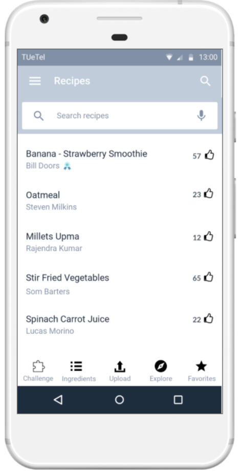
Recipes Section

An option to comment on recipes
What became most apparent was related to a "point system". Most of the participants in this evaluation did not like quantifying what you ate with points and would rather have something like badges or somehow get rid of the point system completely. This problem was discussed in the group and tackled by losing the points but focusing on achievements such as badges.It felt that more improvements on healthy eating could be gained by implementing several functionalities, particularly with regards to the gamification aspect. Therefore, a new element was introduced. A ‘challenges’ section includes the possibility to participate in a challenge such as ‘eating vegan for lunch’. Such challenges have varying durations and some might be more easy or difficult to adhere to. Completing these challenges would also influence the amount and sort of badges earned.

User Profile with Badges

Challenges Section
Two features were introduced based on features in current and existing fitness/meal tracking apps. The first was an option for users to log their meals. The idea behind this feature was for users to keep a track of their meals and intake. They could manually enter their meals or scan a barcode of individual items to log them. In order to introduce a gamification aspect here, we introduced what is commonly known as a "streak" system. This acts as an extrinsic motivator for users to maintain continuity.The second feature introduced here was a macro tracker, and a rating system for the consumption. Based on the meals that they logged, users could track their macros. The system would also rate their consumption based on the macros. This was also aimed at providing additional extrinsic motivation, such that users would be motivated to receive a good rating for consumption.
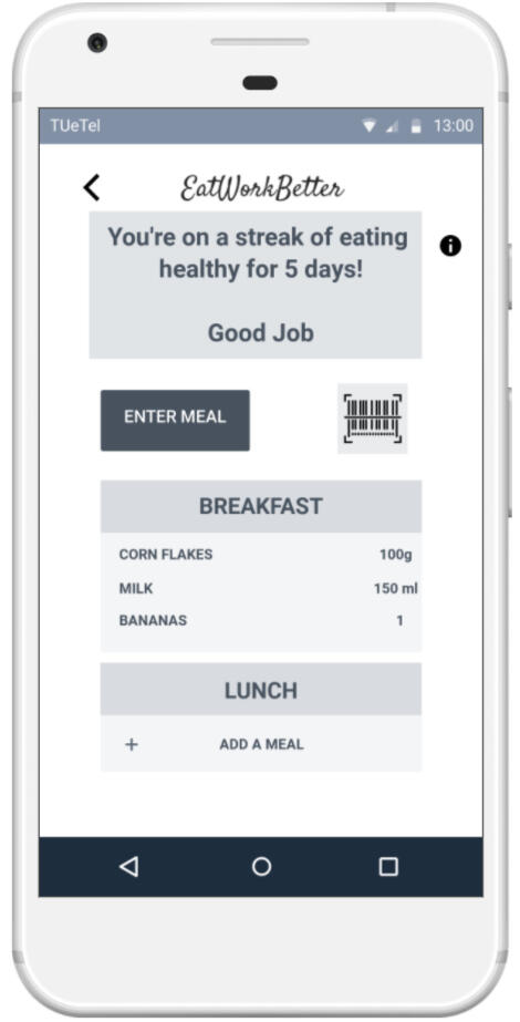
A Provision to Record Meals

Macros Section
Finally, we wanted to induce a feeling of togetherness and team spirit in the young employees. We wanted them to feel like they contributed to the score of the company both individually and collectively, while also motivating them to eat healthy. For this, we provided an option of voting for company lunches. Everyday, 2-3 lunch options were listed, which the employees could vote on for next days lunch.Following the social theme, we also added a notifications section section that would help users stay abreast of what was happening. We were inspired by how social media had a strong influence on people, that for many, the first thing they checked were their social notifications. We wanted to capitalize on this and thus added a notification section.

Voting for Company Lunch

Notifications
Reflection
How do I feel about this project and the outcome?I thoroughly enjoyed this project, because of how much work we were able to do in a short interval, the design process and finally, the outcome - EatWorkBetter. As a team, we had great communication and co-ordination and working with them was a memorable experience. The other thing I loved about this project was how many small details we thought of, spoke about and addressed. I always believe that the smallest things have the biggest differences, and it felt fulfilling to put our thought into details and think about each aspect in creating a rounded experience.What would I have done differently if I had to do this again?I really wanted to conduct a few contextual studies followed by interviews. I would've loved to do that. There were some elements in the design I would've wanted to change. For instance, the macro tracker with different shades of grey may be confusing for some people. This is something I would've done differently.
Get in touch!

Tyler - The Smart Virtual Nurse
Addressing and Enhancing the User Experience of patients in the waiting room before MRI/CT Scan, with a non-human virtual nurse
Project Overview
Client / Project in Collaboration With
Project Course
User Experience Theory and Practise
Duration of the project
March 2019
Scope of the project
Design for the User Experience when stakeholder goals and expected functionality is given, Task Analysis and Modelling, Visual Design of the concept, Prototyping
Tools Used
Marvel (Prototyping), Adobe CC
Team Members
Evie Van Den Munckhof, Else Bolder, Tjalke Zijlstra, Akshay Kudur Rajendra Prasad, Yunjie Liu, Shrivaas Madapusi Sundar
My Roles in the Team
Ideation - proposed the use of a dog (Golden retriever) as a nurse
Involved in design of the process
Part of the combined ideation and design phases for the companion application
Design of the first version of the mobile app prototype
Constraints
Short duration of project meant shorter time to conduct user research. However, the problem was described in detail by Philips Design
Time and permission constraints to conduct contextual study on the subjects
PROBLEM
How can we improve the user experience of a patient awaiting a CT Scan/MRI in a "smart changing room", by the use of a non-human virtual nurse?
Stakeholder Goals provided by Philips
Enlisted below are the various stakeholders and what the expected goals are -
Management - Feel less stressed, Provide better care to those who need it.
Patient - Feel well prepared, Feel well taken care of, Feel safe, Sense of privacy, Comfort
Radiographer - Feel less stressed, provide better care to those who need it.
Philips - Make profit, Provide value to the customers and patients, Increase brand value, Create ecosystems
Functionality / Features expected from Philips
Enlisted below are the functionalities and features expected from the system -
Inform Patient - Expected time for CT Scan/MRI to start
Screening Questions - To make sure its safe and appropriate to scan the patient - can be presented at once or step by step
Instructions for Patient - Make sure that the patient is prepared for the scan
An option to call real nurse - In case of discomfort, emergency and/or difficulties with understanding virtual nurse
But who will be our non-human virtual nurse?
When designing for sensitive areas like changing rooms, and for patients who are likely to be anxious about the test ahead, it is important to consider a few critical and crucial criteria. The reason for considering a virtual nurse is to eliminate human presence in the changing room and make patients feel comfortable. Thus, it is important that patients don't feel an invasion of privacy, like someone is looking at them or intimidated by this nurse in any way.It is important that the nurse is friendly, welcoming and is able to provide clear and understandable guidance to the patient.But who can potentially be this virtual nurse the fulfils all the criteria?

SOLUTION

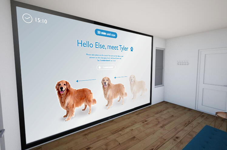
Meet Tyler, our resident Golden Retriever virtual nurse
Why a dog?
Since the nurse was non-human and virtual, we thought a pet would fit the bill perfectly. Even though Tyler is not human, people are capable of reading a dog’s body language and facial expressions, which contributes to a rich interaction. Based on literature, it was assumed that people would feel comfortable in the presence of a dog.Another factor, also backed by research literature is that a dog is a neutral figure, and a neutral figure reduces the chances of stressful reaction. Choosing to use the virtual nurse would also give the patients a sense of autonomy.
But why not a cat?
When we thought of a pet for a virtual nurse, we only had two options in mind - a dog or a cat. However, as per secondary research, dogs were well preferred as pets than cats. This sealed the decision of going with a dog.

Philips CarePlus - the companion application to create a rounded experience and prepare patients for the CT Scan/MRI
CT Scans/MRIs are complex procedures and they may be intimidating for a few patients. When working on patient experience, we also felt it was very important to prepare the patient for this procedure. The patients would also meet Tyler, so we wanted to make sure they knew of this.Taking stakeholder goals and features enlisted by Philips, we created the Philips CarePlus concept. This mobile application contained a timeline of the patients' appointments, a platform for them to answer screening questions and a way to prepare them for the CT Scan and MRI. You can see the different aspects of this in this section.In the screens below, all the appointments of the patient including details of a particular appointment as well expected date of results is informed. The patients have an option to answer the pre procedure questions through this section.


The prep questions for this procedure focus on factors essential to this procedure. We also ask whether the patient is claustrophobic so that the hospital may be informed and prepared accordingly. We also ask them about recent surgeries, or implants that the patients have.


We also added a progress bar for the prep questions so that the patients have an idea of how many questions they've answered and how many more are left. Two key features of the CarePlus app can be noticed here. Firstly, we provide patients with the ability to opt out of using Tyler to be their virtual nurse.
Secondly, we use this application to provide the patients with a sound clip of what the machines would sound like, as well as a 360 degree view of the machine itself. We felt this would enable new patients to be prepared for what lay ahead of them in the scan procedure.


The Patient Experience

DESIGN OF THE SMART ROOM
This section details the step by step procedure that the patients would follow. This would be projected onto a screen in the changing room. Interaction takes place through both touch and voice commands. The visuals presented in this section were created by Evie/Else.We start off with Tyler walking on the screen as the preparation procedure in the smart changing room begins.

As Tyler waits for the patient to respond and begin the preparation, he sits down and waits patiently like a real dog would.

As mentioned, the user always has an option to call the real nurse. This option is always presented on the screen, which the patient can once again access through touch or voice commands. When they do this, Tyler walks over and points to that option.

If the users did not answer the screening questions through the CarePlus app, they have an option to do so now. If they already did, this step is omitted. The patient is asking to change into the hospital gown.

If the patient chooses to answer the screening questions in the changing room, interaction can once again happen through touch or voice. Whichever option the patient chooses, Tyler walks over and places his paws on that option.

Following this, Tyler walks over the locker and points towards the locker where the hospital gown is placed. The patient is also given further instructions on storing their own personal items and valuables.

After they change into the gown, the patients are given two options. If they did not use the CarePlus app to listen to the machine and get a 360 degree view of it, they could do so in this step. For those who did use the CarePlus app and already knew about the scan process, they could play with Tyler using voice commands. The idea behind this was to give patients a way to spend time until their scan, while trying to shift their attention/worries away from the scan and lighten their mood.

Some of the voice commands that patients could use to play with Tyler are shown here

Before the patient heads in for the scan, a final checklist is used to double check all the steps to be taken from the patients end. This is to ensure that patients are fully prepared and to ease their potential anxiety about whether they're fully prepared.

Reflection
How do I feel about this project and the outcome?Since I love dogs, I loved creating and working on this concept. Philips is known for their landmarks in the healthcare industry and one thing that stood out to me was Philips' MRI and CT Scan machines for kids with cartoons and children's art. This inspired me to think of how a pet would cater to people of all age groups and how it would be fun to have something to play with before these procedures. In such a short duration, I am very happy with what we could come up with for a client like Philips Design. This was only possible due to the co-ordination and varied skills of our team, and the team work we were able to exhibit working on this project.What would I have done differently if I had to do this again?I wish we had some more time, if we were to do it once again. I would love to be able to conduct contextual user research and stakeholder research with doctors and lab technicians. I would also love to conduct more usability testing with users and see how we could further refine this concept.However, this project gave us a taste of life in the industry, having to take ad-hoc decisions, sometimes with lesser time and a larger team. It also taught us great team work. I'm thankful to have been able to work with one of the global leaders in healthcare design.
Get in touch!

Tovertafel Share
Improving the functionality of the Tovertafel, to include multiple stakeholders such as families and caretakers, through personalization of the Tovertafel
**How can we extend the functionality of the Tovertafel, while involving multiple stakeholders? **
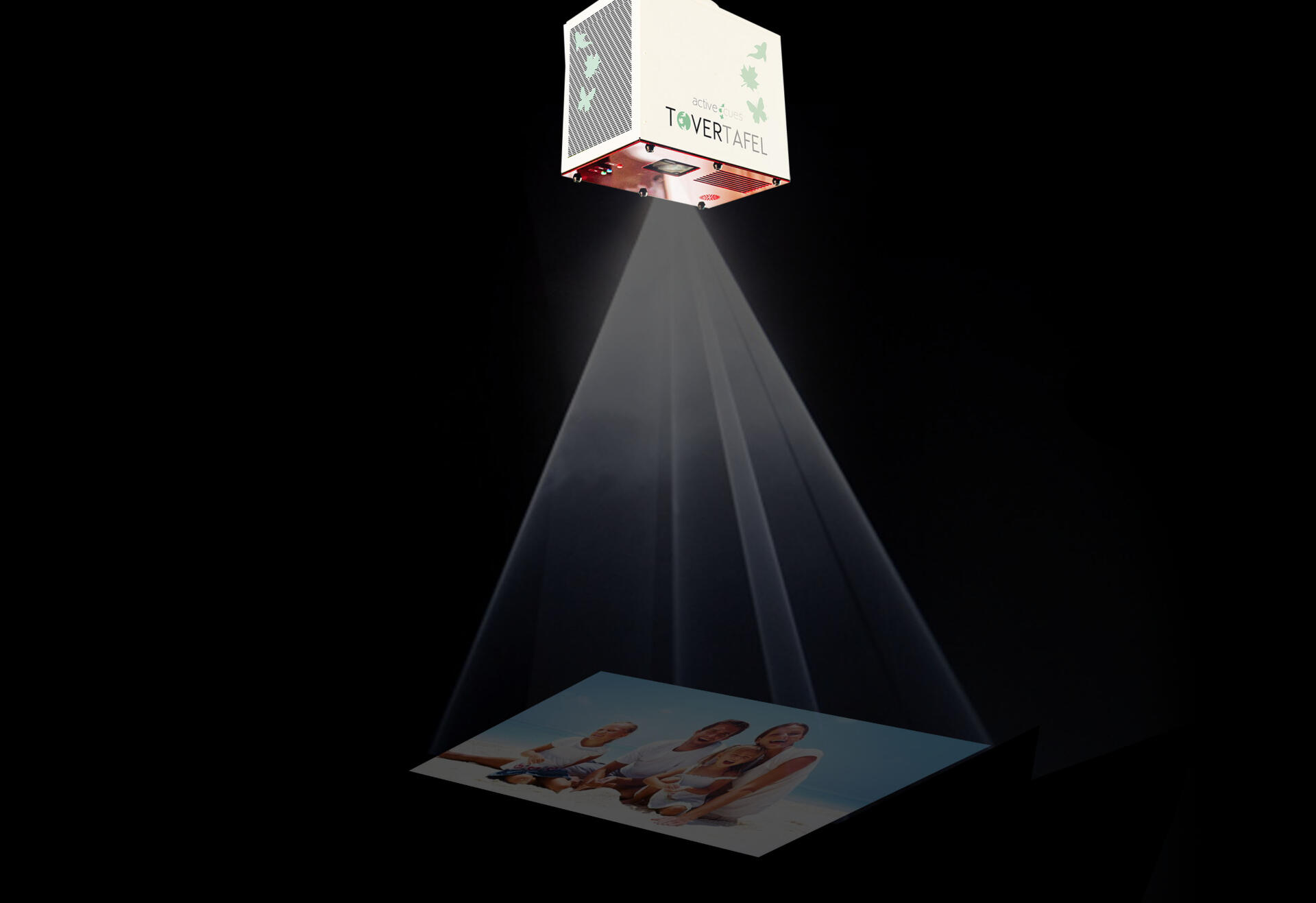
For this project, the focus was twofold - to involve different stakeholders (including additional ones not involved now) and to extend the functionality of the Tovertafel (Dutch for magic table). Tovertafel is a device used to keep the eldery in the final stage of dementia active, both physically and mentally. We decided to use personalization, involve new stakeholders (family of pateints) and focussed on activating the keeping the pateints mentally active.
Client / Project in Collaboration With
Tover B.V. (Then - Active Cues)
Project Course
Design with and for Multiple Stakeholders
Duration of the project
February 2019 - March 2019
Scope of the project
Experience Design with multiple stakeholders in consideration, iterative design to extend functionality, service design, Highlighting feature value for stakeholders.
Tools Used
Marvel (Prototyping), Adobe CC, Value Flow Model, Value Proposition Framework, SWOT Analysis, Board of Innovation
Team Members
Max van der Mars, Femke Fine, Akshay Kudur Rajendra Prasad, Shrivaas Madapusi Sundar
My Roles in the Team
Ideation - proposed the use of a mobile app, with a family and a caretaker version
Contextual Study - Interacting with professors, caretakers, contextual observation of dementia patients
Involved in building of Value Flow, Board of Innovation and SWOT Analysis
Design of the the mobile app prototype
Constraints
Short duration of project meant shorter time to focus on and build from user research
Time and permission constraints to conduct usability testing with families and caretakers
PROBLEM
How can we expand and enrich the impact we achieve with Tovertafel Original, by adding a feature / service / application that adds value for all stakeholders involved?
Discovery
To first understand how the Tovertafel worked, and to get the perspective of stakeholders like professors and caretakers, we headed to Summa College Eindhoven, where they had dementia care and a Tovertafel. The professors from the university set up the Tovertafel for us. They introduced the Tovertafel and its various apps to us, and then we spent some time using and playing with the Tovertafel to understand what it really is like (Click to view some videos). This was very insightful since it helped us gain an understanding of its working.


After using the Tovertafel for over 2 hours, we headed to the care center for dementia patients, where caretakers were interacting with the patients (no pictures to respect privacy). Here, we maintained a respectful distance and observed the caretakers interacting with the patients. We observed one thing during this period. When the caretakers sang old Dutch songs/rhymes, some patients sang a line or two along with them. This took us by surprise since we were under the assumption that dementia patients wouldn't be able to recollect such things like songs, or even remember them temporarily.
"When the caretakers sang old Dutch songs/rhymes, some patients sang a line or two along with them"
We went with this observation to the professors and a representative from Active Cues who indeed confirmed that this was true. There is also an option on the Tovertafel that played old songs/rhymes. This got us thinking and we took this observation to our ideation session. Here we each came up with a few ideas of our own, and presented it to the group.From these ideas, we decided to go with personalization, to work on the key observation we made earlier, and to further stimulate their memory and mental working.
SOLUTION
Tovertafel Share
We were motivated by the key observation we made. We wanted to translate this into our final solution.Thus, we came up with Tovertafel Share. Through Tovertafel share, we wanted to enable the families of the patients to share both memories from their younger days, as well as timely family updates, which the caretakers could then show to the dementia patients.Personal media included songs and music, messages, pictures and videos. The family use the companion application to upload this to Tovertafel servers. The caretakers receive an update and proceed to use the Tovertafel to show this to the patients when they interact with the Tovertafel.What we hope to achieve through this is to activate the memory and mental activity of the patients with dementia, in the hope that they may remember small bits and portions of these memories.

Tovertafel Share - Companion App
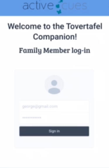
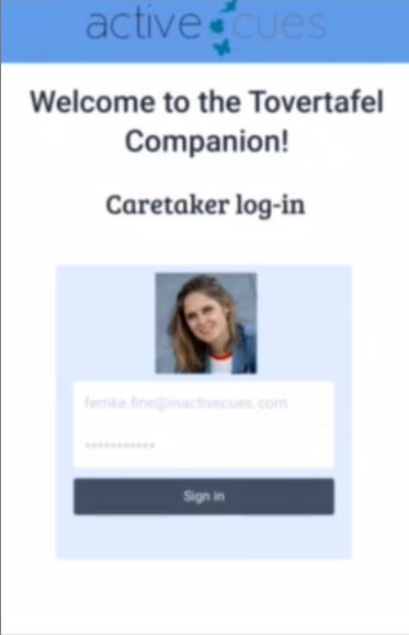
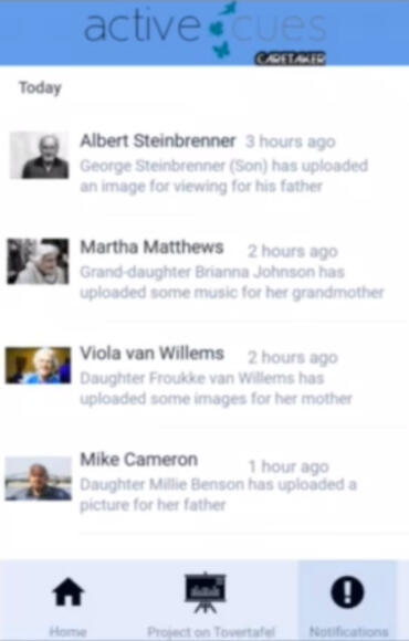
To provide the family and caretakers with a medium to share and upload media, we came up with the concept of the Tovertafel Share companion app. This app also included an additional feature at both ends where the caretaker could share updates about the patient to the family and the family could keep a tab on this.This was my first ever attempt at creating a prototype. Shown below is the family's end of the application. Through this application they get updates about the family members' health, can contact the caretaker directly and can upload different media for the caretaker to show the patients.
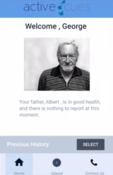
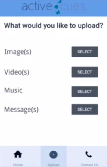
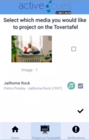
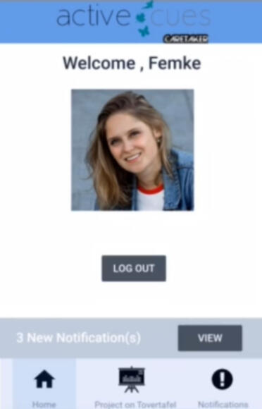
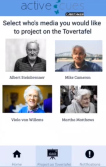
Below, the caretakers version of the app is showcased. Here, the caretakers have the option to project the media that the family shared. Whenever the family members upload something, they see receive a notification regarding this. There is a dedicated tab to project media through the Tovertafel. There is also an option wherein the caretakers can project media based on the patient itself.
Business Revenue Model - Board of Innovation

Value Flow Model showcasing the flow of values between stakeholders

Reflection
How do I feel about this project and the outcome?This was a very impactful project for me. Working with people with dementia gave me a new perspective to design as well as life itself. I was happy with the outcome of this project, since it was my first client based UX project. This was also my first time making a mobile prototype (which I believe is fairly evident), but I took initiative and did it, so I was happy with that.What would I have done differently if I had to do this again?I would love to conduct some usability testing with the caretakers and family. I would also love to spend more time in the care home observing the patients and caretakers. This was not possible due to time and permission constraints, but I'm sure we could've unearthed more insights, had we had additional time.
Get in touch!

Universal Driver Controller
Enhancing the user experience of drivers in vehicles by addressing safety and driver distraction through mapping most used controls on a single controller on the wheel.
Project Course
Design for Focussed and Peripheral Interaction
Duration of the project
February 2019 - March 2019
Scope of the project
UX Design for physical product, Design for the periphery, Design for driver safety, Wizard of Oz testing
Tools Used
Drilling machine and saw (quite literally), Adobe CC, Google Forms
Team Members
My Roles in the Team
Identification of use case - mapping the most used comfort functions in a touch screen to a physical controller that can be used in their periphery
Identifying the most used comfort functions through interviews and questionnaire
Involved in study design and conducting usability testing
Constraints
Time restrictions did not allow us to create a high level prototype or use the driving simulator. Thus we made our steering wheel and controller for a Wizard of Oz setup
Being in a student environment meant that there was no access to cars to conduct in person study
First Prototype
In a quick and dirty prototyping workshop, we were asked to identify a use case where activity that's currently executed in the focus of attention could be executed in the periphery. Given the automotive backgrounds of two of the team members, we were able to identify an issue in today's vehicles - even the most used functions (such as the music, AC functions, seat adjustments) were being moved to touchscreens, and drivers had to take their eyes (and thus their attention) off the road to make even minor tweaks.We were tasked with creating a quick and dirty prototype of this concept using things we had at home. Shown below is the first prototype we came up with and imagined - that there would be a dial on the center console for drivers to execute in their periphery.


We decided to focus on the climate control and infotainment system. So after this workshop, we sent out a questionnaire asking people what features they used most in the climate control and the infotainment system to confirm our assumptions. Following this, we decided to build the second iteration of the prototype.
Final Design
After some interaction with the first prototype, a smaller prototype with short X-shaped channels was developed. This motivated repositioning the controller to the steering wheel for a shorter reach for the driver. The aim was to have the interaction with the controller in the periphery and using the most common gestures of rotating and sliding. The limited number of coherent interactions with the close proximity to the normal position of the hands encourages forming muscle memory.For visual feedback, the change of the functions were displayed in the dashboard. The feedback is not necessary for interaction, being peripheral for most interactions, but can be used in the focus if desired.

Renders by Mart Ole
Making The Final Prototype
The prototype wheel was made with wood, with a support mechanism at the back of the wheel to aid the motion created by the elastic band. This was attached to a screw mount so as to create a fixed wheel feeling. The controller remained at the center, held in position by elastic bands and it could be moved to the corners. The steering wheel was painted black and the button grey. According to the theory of attention and visual search, the slight contrast can be seen better in the periphery.


Testing
Wizard of Oz user testing was performed with 6 users wherein I played the role of the wizard. Visual feedback (speedometer) was provided through the laptop, while users drove along with a driving video. Mart interacted with them and struck conversation while asking interview questions.Before performing the Wizard of Oz test, we tested the prototype within the team itself. First I ensured all functionality was working. When there was a small issue in the mechanism, Mart (who made the mechanism) fixed it immediately (Click the image on the right to view a video).


Wizard of Oz user testing was performed with 6 users wherein I played the role of the wizard. Visual feedback (speedometer) was provided through the laptop, while users drove along with a driving video. Mart interacted with them and struck conversation while asking interview questions.

The users appreciated that the most used functions were available in a single controller. The visual feedback was regarded helpful. As the gateways on the prototype were not visible, they found the direction of movement a little hard to comprehend. Sliding the controller in the gateways felt notchy for the quality of the prototype.All the participants could use it in the periphery for at least one of nine interactions. It was observed that all the participants were using controller while turning the steering wheel. They also constantly kept two fingers on the controller while driving. The requirement to hold the controller in the dedicated gateway while rotating the controller was observed to take time to learn.
Reflection
How do I feel about this project and the outcome?This project was fun to work on since it was my first ever UX project. It also taught me that UX is beyond digital products, and it concerns experience design surrounding even physical products. It was also quite relevant given the direction the automotive industry is taking in terms of moving to touch screens.What would I have done differently if I had to do this again?I would love to be able to go with people in car and see how they use their infotainment systems. This would be quite relatable since it will give me first hand insight into what they do and how they do it.
Get in touch!
About Me


Who am I?
I am Shrivaas, UX enthusiast and an automotive fanatic. I am a Masters' graduate in Automotive Technology from TU Eindhoven, with a specialization in User Centered Design. I am driven by a desire to solve problems and create minimal, intuitive, practical and engaging experiences for people. A recent graduate and a UX enthusiast, I look forward to taking the next step in my career with fervor.
My Journey
My journey in UX began with my love for driving. I liked driving some cars and didn't like driving others. I understood then that it was the experience that made a difference to me. A curiosity to explore, understand and redefine experiences in vehicles lead me to pursue user centered design and I fell in love with UX through this journey.Through the various projects I executed in a variety of domains, I gained first experience in working in different contexts and with different kinds of users and environments. I enjoy being a part of every step of the user centered design cycle and don’t hesitate to take on challenges. I put the users ahead of the technology since I strongly believe that technology should work for the users, and not the other way round.


Who am I beyond UX?
I love motorsport - a love which began watching Michael Schumacher drive the red car around as a kid. 20 years on, I am still a Ferrari fan. Besides Formula 1, I also take keen interest in MotoGP (Ducati) and WEC.I love to cook - it is therapeutic and a great way for me to unwind after a long day. The reward of a great meal makes it absolutely worth it!I love music - Music is a big part of my world. I have a varied taste and listen to everything from the 70's to modern music. We can always speak about music!I love to travel - Traveling opens doors to a new world of cultures, traditions, experiences and food. It is a beautiful world out there, and I have a thirst for travel that's never quenched.And lastly, I love to learn - learning is a process that never ends, and I love to learn more about things I'm most interested in.

Get in touch!
Let us get in touch!
I hope there is something about my portfolio and work you loved, that brought you to this page. I would love to talk more about it. If you have an opportunity for me, or would like to talk about my work, let us connect!We can connect over social media (LinkedIn and Twitter), Email or through a video call. The links to my social media and video call platforms can be found on this page.